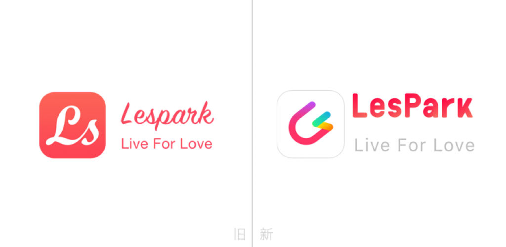
The logo you see now looks like this, like a paper clip, also like a magnet, in fact, this is the third version of LesPark logo.

The first version of the logo looked like this, it was a serial LS,

In the three years since the first version of the logo was born, LesPark has been developing rapidly and breaking through itself. In order to let everyone witness the growth of LesPark, so we have the second version of the logo,

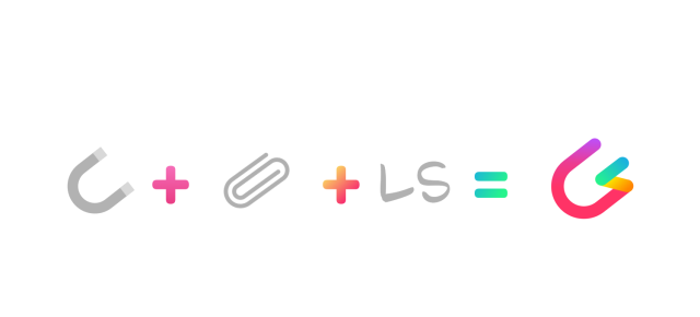
The design concept of the second edition of the logo needs to be highlighted, which is inspired by the paper clip (curved like a paper clip), magnet (attracted by personality, hobbies, likes, etc.) and LS.

People will wonder why our icon is not designed as a full paper clip? Why is there a gap? That's because we want to tell you that LesPark is a global-oriented social platform, more open, more inclusive and accepting of global women. And same sex can attract. Let's connect you and me with LS to show our unique selves.
"Color" : The old LOGO font color was a single white, this new LOGO design adds a rainbow gradient effect. The white background color brings out the bright color of the rainbow. The rainbow also represents us LesPark is a social platform designed specifically for women.
The color changes gradually from cold to warm, hoping that everyone can bond with LesPark and quickly integrate into this warm family.

Today, 9 years after LesPark was launched, it still maintains a stable trend of user traffic and profit growth. LesPark's users cover more than 30 countries and regions, mainly in Asia Pacific, Europe and the United States and other regions, where there are more than 30 million global women. LesPark's continuous development is also witnessed by our logo. The third edition of our logo continues the shape of the second edition. The font color is back to white, and the background color is also changed gradually from cold to warm, representing our original intention to Live For Love, and we also hope that everyone can be connected by LesPark.,Quickly integrate into the family.